When you’re working to improve your website’s performance, a waterfall chart is like a visual roadmap that shows you exactly where your site might need a boost. Whether you’re trying to speed up load times, improve the user experience, or fix any bottlenecks, understanding how to read and interpret a waterfall chart is key. This tool reveals the exact sequence in which assets like images, scripts, and stylesheets load on your site, helping you pinpoint areas for improvement and make informed decisions about optimization.
This guide dives into what waterfall charts are, how they work, and ways to use them to make smarter performance tweaks for a faster, smoother website. And if you’re looking for a solution that takes the guesswork out of web monitoring, Dotcom-Monitor can be a great asset that seamlessly displays performance insights to help you optimize and maintain a high-performance site.
What is a Waterfall Chart?
A waterfall chart is a type of data visualization that provides a detailed view of how individual resources on your website load over time. Each bar in the chart represents a request for a resource (such as an image, script, or CSS file) and shows when that resource is requested, how long it takes to load, and how it interacts with other resources. Think of it as a timeline of how your website assembles for the user that reveals exactly what happens from the moment they type your URL to the final render of your page.
Waterfall charts break down the loading process into various stages:
- DNS Lookup: The time taken to resolve your domain name into an IP address.
- Connection Time: How long it takes to establish a connection with the server.
- SSL Handshake: If your site uses HTTPS, this shows the time taken to establish a secure connection.
- Waiting/TTFB (Time to First Byte): The time between requesting and receiving the first byte of data from the server.
- Content Download: The time it takes to fully download a resource, like an image or JavaScript file.
By visualizing all these stages for each element on the page, waterfall charts offer insights into how every component contributes to the total load time. It’s a powerful tool for understanding where delays or bottlenecks might exist on your website.
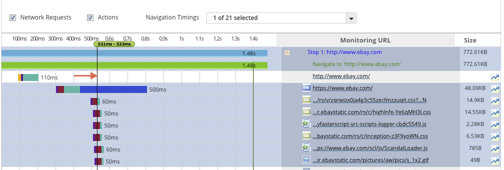
The screenshot below is a sample of a waterfall chart from amazon.com to introduce what waterfall charts look like. As you can see, there are a lot of different elements that come into play during the page’s load time. Some of those factors include the following such as URL, Test Location, Browser (Chrome, Firefox, Internet Explorer, mobile browsers etc.), Connection, Number of Tests, and Repeat View.

Why Waterfall Charts Matter for Web Performance
Waterfall charts provide a clear breakdown of your website’s loading process, allowing you to spot specific issues and target solutions directly. In today’s digital landscape, web performance has a significant impact on user satisfaction, conversion rates, and search engine rankings. A delay of even a second in page load time can reduce conversions by up to 7% which makes any optimization of every millisecond crucial.
When using waterfall charts as part of your website monitoring routine, you gain access to several benefits:
- Pinpointing Bottlenecks: Waterfall charts allow you to see which elements are taking longer to load, helping you identify specific resources that may be slowing down your site.
- Improving Load Time Efficiency: By breaking down the loading sequence, you can reorder or prioritize resources to ensure crucial elements load first for a smoother user experience.
- Reducing Unnecessary Requests: If you see repeated or redundant requests, you can consolidate them or remove unnecessary elements to minimize the overall load time.
- Enhancing Core Web Vitals: As Google continues to prioritize Core Web Vitals in its ranking algorithms, optimizing based on waterfall chart insights can help improve your scores for metrics like Largest Contentful Paint (LCP) and First Input Delay (FID), which are important for search visibility. This is especially important when using Google Page Insights.
Understanding the Parts of a Waterfall Chart
When you open a waterfall chart in a website monitoring tool like Dotcom-Monitor, you’ll see multiple color-coded bars that represent various stages in the loading process for each request. Here’s a breakdown of what each section typically means:
Interactive Slider: The Interactive Slider is an indicator of the performance of each element in terms of milliseconds. In the image below, it is pointed at with the arrow. The user can drag the interactive slider to see which element is being loaded, and at what point in time. In this screenshot, you can see the highlighted elements are being loaded in the 531st millisecond.
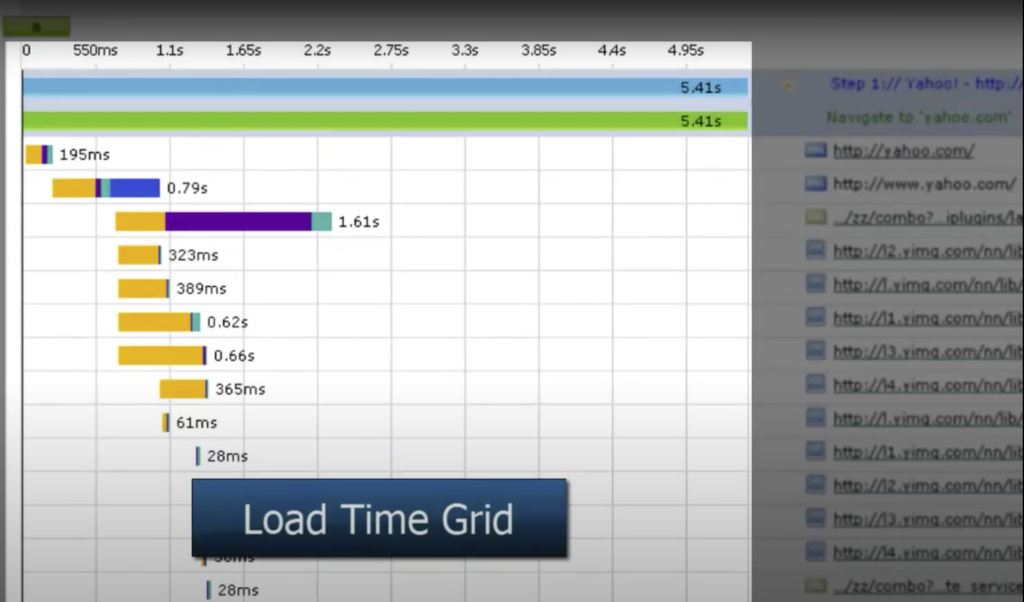
Load Time Grid: The highlighted area below is called Load Time Grid. It shows how much time it takes to load each element.
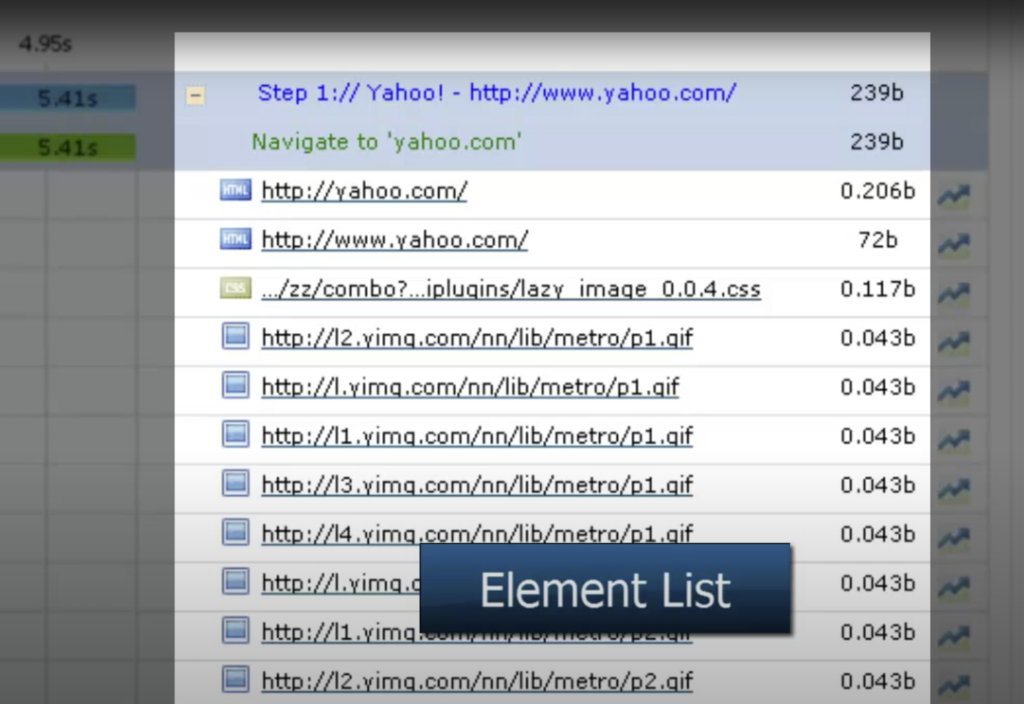
Element List: The elements that exist on the web page are shown in the Element List. The element’s extension can be HTML, CSS, GIF, etc.
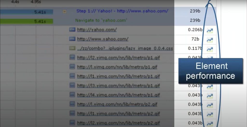
Element Performance: A user can obtain information on the performance of each element that exists in the waterfall chart.
When the user clicks on the specific element button, they are shown a performance page, shown below.
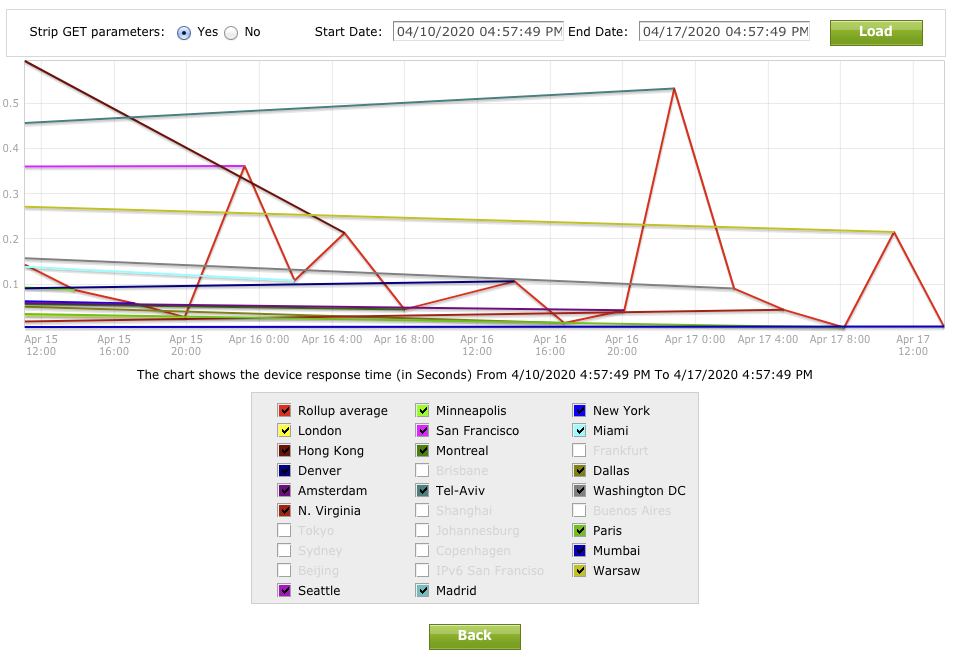 By analyzing the performance page, users gain deeper insight into response details. They can select a specific area and release the mouse button to view detailed information. Performance issues are indicated by red-marked areas, highlighting periods of reduced performance.
Load Time Details for Individual Elements: In the waterfall chart, when users hover over a specific bar, they see load time details such as DNS Time, Connect Time, SSL Time, Request Time, First Byte Time, Response Time, Start Time, End Time, and Speed, highlighted within a red oval for easy identification.
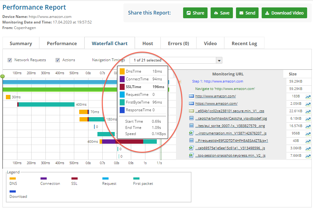
Explanation of Color Coding: Within in Dotcom-Monitor platform, the representation of load time details is defined by the following colors:

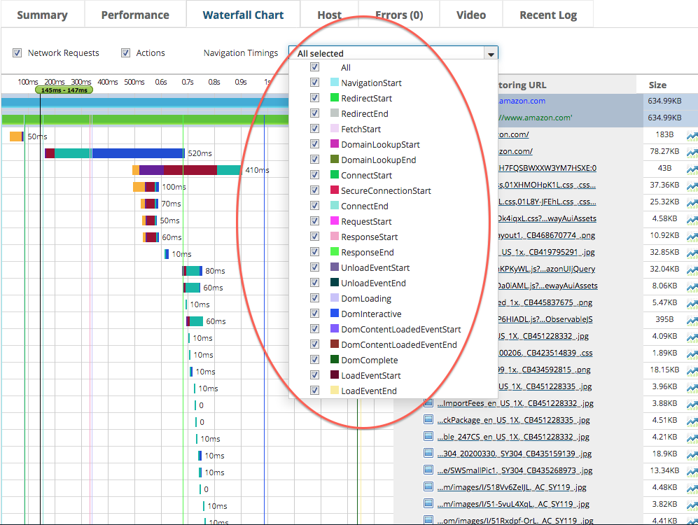
Navigation Timings: They can be shown as a column in the waterfall chart to show the Navigation Start, Redirect Start, Redirect End, Fetch Start, Domain Lookup Start, Domain Lookup End, Connect Start, Secure Connection Start, Connect End, Request Start, Response Start, Response End, Unload Event Start, Unload Event End, DOM Loading, DOM Interactive, DOM Content Loaded Event Start, DOM Content Loaded Event End, DOM Complete, Load Event Start, and Load Event End with color coding (shown below within the red oval).
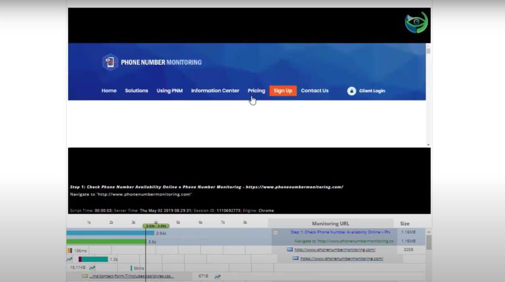
Notably, the Dotcom-Monitor platform also offers a feature where users can watch a video of the URL loading in a browser window which provides a real-time view of the loading process (as shown below).
Key Optimization Tips Based on Waterfall Chart Analysis
Now that you understand the components of a waterfall chart, let’s explore actionable ways to optimize your site based on insights from this tool.
1. Reduce DNS Lookup Times
Long DNS lookup times can slow down the overall load time of your page. Switching to a faster DNS provider or using a content delivery network (CDN) can help reduce lookup times to ensure that users can connect to your site more quickly.
2. Improve Server Response Times (TTFB)
A high Time to First Byte (TTFB) often indicates server issues or inefficient backend processes. Some quick ways to improve TTFB include optimizing your database queries, reducing backend processing, or upgrading to a faster server. For sites with frequent traffic, consider load balancing to distribute the load across multiple servers and reduce TTFB during high-traffic times.
3. Minimize SSL Handshake Delays
SSL handshake times can add up, especially for sites that serve secure content. Optimizing your SSL configuration and using a modern TLS version can help speed up this process. If you’re working with high traffic, consider using a CDN with SSL support to reduce latency for global users.
4. Reduce HTTP Requests
The more requests your website makes, the longer it takes to load. To reduce the total number of HTTP requests, consider combining CSS and JavaScript files, using CSS sprites for images, and embedding smaller icons directly into the CSS. Tools like Dotcom-Monitor’s waterfall charts can help you spot redundant requests and provide insights into where you can reduce them.
5. Optimize Resource Loading with Lazy Loading
For image-heavy or content-rich websites, lazy loading can significantly improve load times. By using lazy loading, you delay loading non-critical resources (like images below the fold) until they’re actually needed. This reduces initial page load time which helps users start interacting with your site sooner.
6. Compress and Optimize Images
Images often account for a large portion of a website’s loading time. By compressing and optimizing images, you can reduce their size without sacrificing quality. Many waterfall charts show individual image load times, making it easy to see where optimizations will have the biggest impact.
7. Prioritize Critical CSS and JavaScript
To avoid render-blocking resources, it’s best to prioritize CSS and JavaScript that are essential for the initial page load. You can defer non-essential JavaScript or load it asynchronously which helps the most important elements render first. Waterfall charts can reveal which scripts are slowing down page load to allow you to prioritize or defer them as needed.
Common Issues Revealed by Waterfall Charts (and How to Fix Them)
Waterfall charts can often highlight common web performance issues. Here are some of the most typical problems and their fixes:
- Render-Blocking Resources: JavaScript and CSS files that block page rendering can slow down the perceived load time. Defer or asynchronously load non-essential scripts to prevent this.
- Large Image Files: Large images can significantly slow down your load times. Compress images, use modern formats like WebP, and employ lazy loading to speed things up.
- Too Many Redirects: Redirects add extra HTTP requests that slow down your load time. If you notice multiple redirects, try to consolidate them to improve speed.
- Excessive JavaScript or CSS Files: Too many individual files can lead to numerous HTTP requests which impacts load time. Minimize these files and combine them where possible.
Using Dotcom-Monitor for Waterfall Analysis and Ongoing Performance Monitoring
While a single waterfall chart can uncover valuable insights, keeping your website running smoothly day in and day out requires continuous monitoring to catch and address issues proactively. This is where Dotcom-Monitor’s suite of web performance tools excels. With Dotcom-Monitor, you can schedule ongoing performance checks that monitor your site’s speed, uptime, and response times across different locations and devices to ensure your users always have a seamless experience.
Dotcom-Monitor’s waterfall chart feature provides a detailed, request-by-request breakdown to help you understand exactly how each element of your site loads. This in-depth look allows you to easily pinpoint bottlenecks, identify any loading delays, and discover where optimization efforts can be focused for maximum impact. Whether it’s large image files, third-party scripts, or server response issues, Dotcom-Monitor’s insights simplify the process of tracking down and addressing performance hiccups.
But Dotcom-Monitor doesn’t stop at basic monitoring. It goes beyond with features like customizable alerts that immediately notify you of any performance issues which gives you the chance to respond before they affect users. These alerts can be tailored to specific metrics, so you can receive timely updates on critical changes like increased load times or sudden downtimes to help you stay ahead of potential issues.
Dotcom-Monitor also supports long-term performance improvements by generating comprehensive reports on trends over time. These reports provide the kind of detailed data that can inform your optimization strategies to allow you to make data-driven decisions that enhance both user experience and operational efficiency. By consistently analyzing performance trends, you’re not only resolving issues as they arise but building a faster, more resilient website.
For anyone seeking a robust user-friendly platform to manage and optimize website performance, Dotcom-Monitor offers the ideal blend of continuous monitoring, in-depth insights, and proactive tools. With Dotcom-Monitor by your side, you’ll have the power to fine-tune your website’s performance, ensuring every user interaction is smooth, reliable, and optimized.
Wrapping Up: The Power of Waterfall Charts for Web Performance Optimization
Waterfall charts are an invaluable tool in your web performance optimization toolkit, offering a detailed breakdown of how every element on your page loads. By understanding each part of a waterfall chart, you can pinpoint specific issues, optimize load times, and deliver a faster, more seamless experience to your users.
With a solution like Dotcom-Monitor, you’re not just optimizing for today, you’re setting up your site for continuous success. Try Dotcom-Monitor today for free!


